Neil needed a website that would showcase all the exciting projects that he’s worked worked on and would also feature his ever expanding library of extraordinary music.
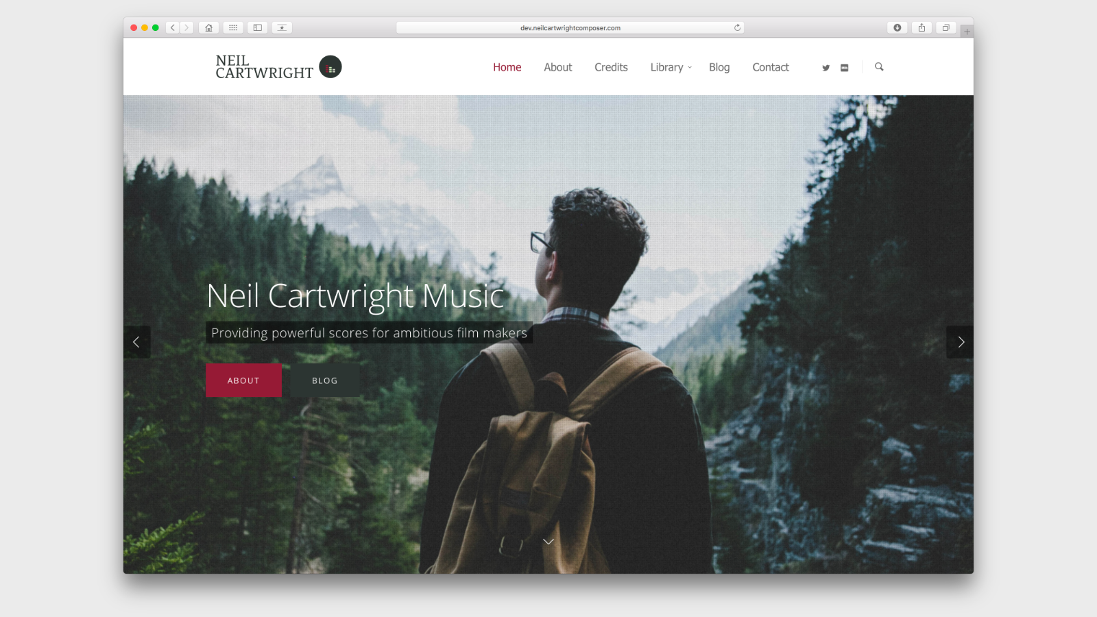
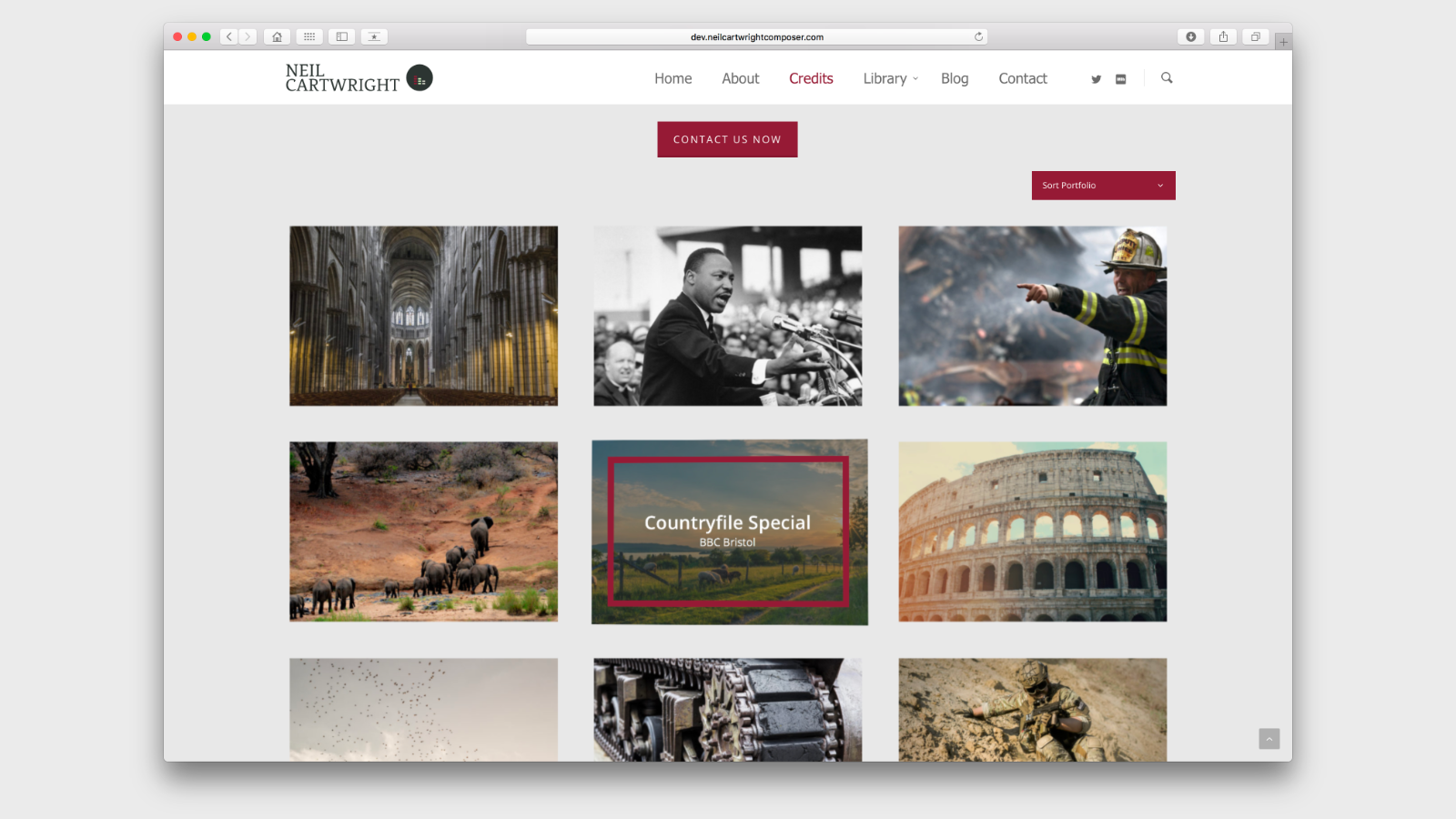
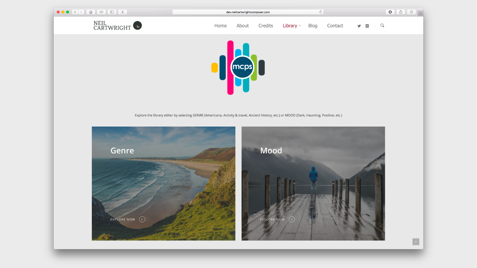
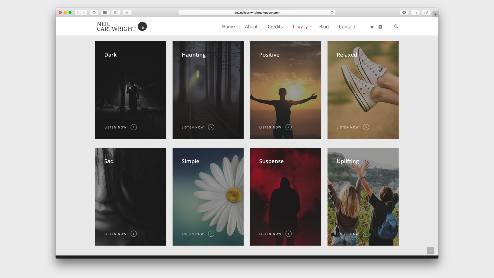
We started by getting together and finding out what Neil wanted to achieve. Neil had realised that his existing website had become cluttered and difficult to navigate so we started by stripping everything back to basics and selecting some great imagery to convey the differences in his compositions.
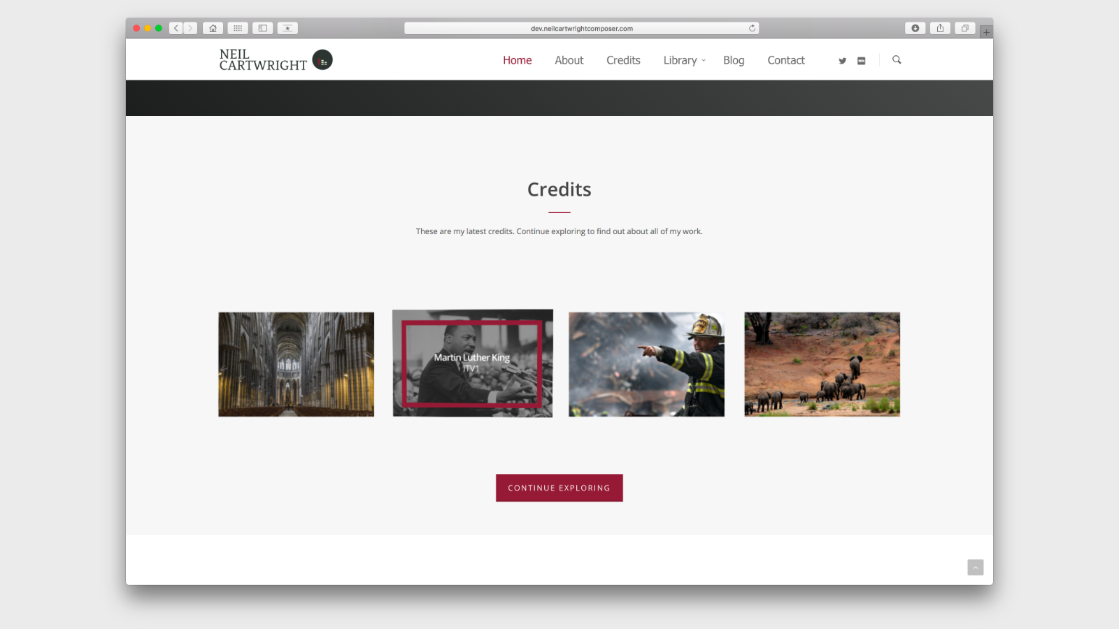
We developed a site that is clean, crisp and easy to navigate despite the fact that it now holds over 300 of his tracks. We wanted to guide users through the site, helping them to find music that could be perfect for their upcoming productions. We also developed a new logo for Neil that mixes modern and traditional to show the breadth of his work.
The new site has received great feedback and we’re looking forward to being a small part of Neil’s ongoing success.

