We always keep an eye out for great rebranding examples, and there’s a lot of fantastic stuff out there. It’s also great to see a horror show of a rebrand (from a distance of course) just to keep us all on our toes.
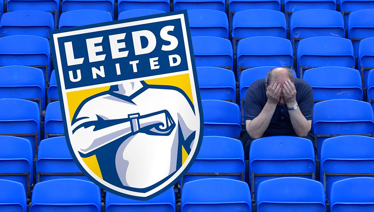
One such disaster happened recently to Leeds United FC.
Having worked and lived in Leeds, I developed a thing for a club where triumph and utter disaster often went hand in hand. I witnessed amazing Champions League nights at Elland Road and I witnessed some serious dross too. Leeds doesn’t do bland, it does crazy and its place at the heart of its community cannot be understated. They are Leeds.
So when I saw their recent rebrand, I couldn’t believe it. Neither could most fans. It’s been described as the worst rebrand in history and I think it could be.
Mark Ritson has an interesting take on the perils of a rebrand which he regards as the most asymmetrical corporate strategy of them all. He says, “There is literally no upside of a nice new logo; there is only pain if you get it wrong. And inevitably it goes wrong a lot of the time.”
This is particularly true when you are a brand that has such emotional meaning to so many people. Leeds has such a rich history, they could have produced something that celebrated their heritage and it would have looked and felt great. But Leeds have always had the ability to totally cock things up and this exercise was no different.
The element of this rebrand that was really interesting was that Leeds announced that the had received ‘overwhelming engagement’ in the rebrand process. They said that the process had taken 6 months, consulted over 10,000 people and had produced a new crest that was ready for the next 100 years. They certainly received ‘overwhelming engagement’ on social media following its launch and the rebrand barely lasted 100 seconds!
The immediate backlash was savage and funny in equal measure (and I imagine it was acutely painful if you were the ones involved in the rebrand process). This developed into an online petition to scrap the new identity that gained over 70,000 signatures in under 24 hours. Barely six hours after the new identity was launched, the club announced that it was under review and that a new identity would be chosen following further consultation with fans.
Ritson summed it up as follows “You take a secret gesture of the club and make it an explicit part of the logo. You use, from what I can gather, an in-house creative team who look like they were using a laptop running Windows 95. You launch it on Twitter and, despite claims of extensive research and engagement, you almost immediately alienate and humiliate your entire supporter base in about three seconds.” Not good.
A logo created, launched, killed and replaced in six hours. But if you are a Leeds fan this is par for the course.
The point we can all take away from this is that people buy into your brand and develop an affinity to it (probably not as strongly as Lees United’s fans!) and as soon as you mess with it, you’re potentially opening yourselves up to all sorts of problems. So tread carefully and take your time if you are going down this road. Really understand your motivations and the potential upsides and downsides. We can help with that!

